Web App · Mobile · Navigation · GIS
Solo-EntwicklungALC-O Area Map: Digital site navigation for the VBS
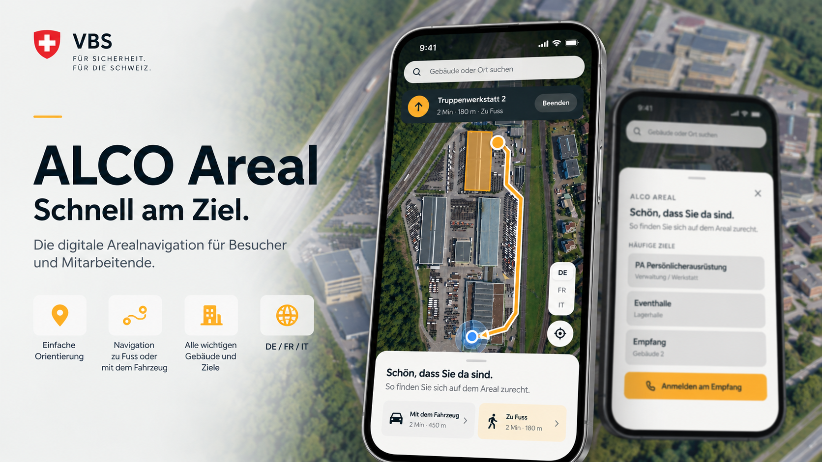
For a VBS site, I developed a web-based, mobile-first site navigation that helps visitors and staff find their way quickly around a complex industrial and logistics area.
- Web App
- Mobile
- Navigation
- GIS
"The challenge wasn't displaying a map. It was turning a complex site into navigation that people understand without any explanation."
The application combines a georeferenced satellite map with buildings, destinations and defined routes. Users pick a place and get navigated straight there, on foot or by vehicle.
The solution was later extensively developed into version 2: a trilingual interface in German, French and Italian, a contextual welcome screen, live navigation with current position and heading, and a completely redesigned administration area.
Requirements engineering
At the start, I analysed the real workflows on site together with the people involved.
Questions included:
- Which buildings and places need to be found?
- Which destinations are searched for most often?
- Which paths may vehicles use?
- Which paths are only suitable for pedestrians?
- Where are sensible starting points?
- What information do external visitors need?
- How can the content be maintained later without developers?
The last point in particular had a strong influence on the architecture.
A statically programmed map would have been easier to build, but every change would have required a new software release.
That's why I designed the solution from the start so that the map data could be administered.
Prototyping and UX
One of the biggest challenges was mobile use.
A user stands on the site, holds their smartphone and wants to know as quickly as possible:
Where am I? Where do I need to go?
The interface was therefore deliberately reduced.
The map is the centre of the application. On top of it sit only the information and controls that matter in the current situation.
The revised version reinforced this approach even further.
When opening the app, users first see frequently used destinations and key information. From there they can switch straight to navigation.
During navigation, the interface is reduced again to the essentials:
destination, direction, distance and remaining time.
Map and geodata
A particular technical challenge was connecting the visual representation of the site with real geographic positions.
Buildings, destinations and routes must be placed precisely on the map.
For this I implemented georeferencing, which links map coordinates with actual geographic positions.
This allows the smartphone's location to be projected onto the internal site map and used for navigation.
Live navigation
Version 2 introduced much stronger navigation.
The user's current location is shown on the map and updated while moving.
The navigation shows, among other things:
- current position
- destination
- calculated route
- remaining distance
- estimated time
- direction of movement
The direction indicator was especially important.
The navigation arrow follows the current orientation of the smartphone, so users see intuitively which way to go.
It sounds like a small UX detail, but it changes the usability of the application considerably.
Pedestrian and vehicle navigation
Not every route on a site works for every type of traffic.
The application therefore supports separate routes for pedestrians and vehicles.
Depending on the selection, different paths are taken into account and the right route is calculated.
Distance and expected travel time are shown as well.
This turned a simple location map into a real internal navigation system.
Multilingual
Since the solution is used in a Swiss context, the application was designed for multiple languages from the ground up.
Currently available:
German · French · Italian
The language can be switched directly within the map view.
Internationalisation wasn't limited to individual texts; it was part of the application concept from the start.
Administration area
A key part of version 2 was a completely new administration area.
My goal was to largely decouple map maintenance from software development.
Administrators can now edit content themselves.
Building editor
Buildings can be drawn and edited directly on the map.
New buildings or changes to the site can be captured without storing geometries manually in the source code.
Route editor
Paths and navigation routes can also be defined directly on the map.
This lets the internal path network be adapted when access roads, routing or usable paths change.
Georeferencing
The administration area allows mapping between the graphic map and real geographic coordinates.
This keeps the map view compatible with GPS positions.
User management
Administrative functions are secured through user management.
Permissions for maintaining the application can be managed centrally.
Usage statistics
I also integrated usage statistics.
They show how often the map is used and which areas and features matter most.
My impact
In this project, my contribution went far beyond developing individual components.
I was responsible for large parts of the solution end to end.
This included:
Requirements engineering → product concept → prototyping → UX/UI → architecture → implementation → testing → deployment → further development
What I valued most was bringing different disciplines together.
The project combines classic web development with:
geodata, GPS, map visualisation, routing, mobile UX and admin tooling.